In an increasingly digital world, the need for visually compelling presentations has never been more critical. When aiming to secure investors, a well-crafted presentation can make all the difference between a nod of approval or a shaking head. It's not just about the content; the design plays a significant role in conveying your message powerfully and effectively.
Staying on top of the latest presentation design trends will work in your favour if you want to leave a lasting impression.
Why design matters in investor presentations
Before diving into the trends, it's essential to understand why design is pivotal in investor presentations. According to scientific research, the human brain recognises images within 13 milliseconds. To put that in perspective, it takes 300 to 400 milliseconds to blink, which is 1/3 of a second.
Given these statistics, a well-designed presentation is not just an aesthetic choice but a strategic one to get to the point more effectively.
Top presentation design trends
As technology evolves, presentation design trends also develop. Knowing the latest trends can give your presentations an edge, making them more captivating and engaging.
In this section, we will show you examples of top presentation design trends, including augmented reality, motion graphics, minimalist layouts, and more.
1. Minimalism: less is more
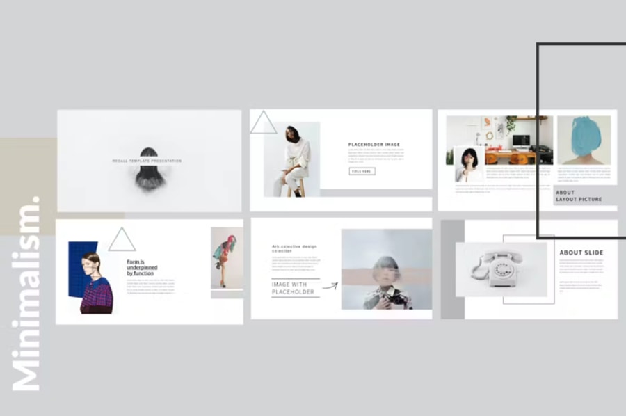
It's time to leave cluttered slides behind. Minimalism is in, and it's all about focusing on the essentials because using fewer elements will let your audiences focus on what's important. Minimalistic designs create a sense of professionalism, simplicity, and elegance. By removing unnecessary elements, the audience can grasp information more quickly, and the overall impact of the presentation is heightened.
Use simple backgrounds, fewer words, neutral colours, and more impactful images to leverage this trend.
2. Storytelling: narrative-driven layouts
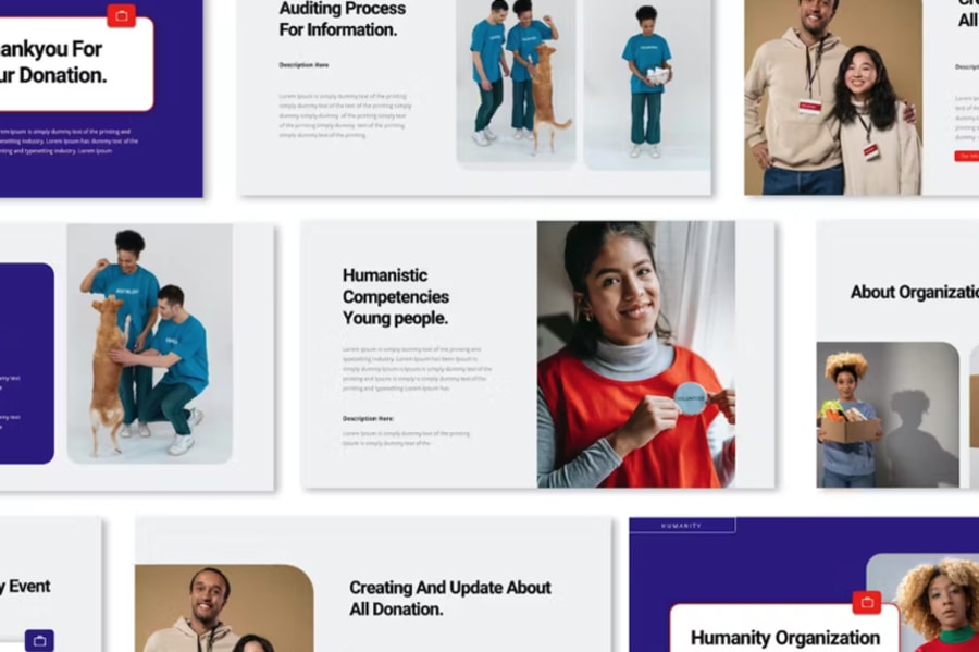
Storytelling has made its way into presentations, driving the flow from one slide to another. Instead of listing facts, aim to take the investors on a journey.
Telling a story can bring life and impact to a presentation through narrative-driven layouts. Start by defining a clear and compelling story arc that connects with your audience.
Visual imagery, sequential layouts, and relatable characters or scenarios guide the storytelling. Incorporate tension, resolution, and emotional elements to captivate and leave a lasting impression on your audience.
3. Dynamic fonts: say goodbye to default fonts
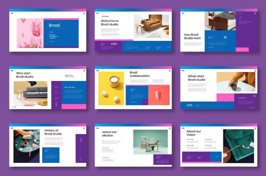
Custom fonts have become more accessible. Fonts like Helvetica Neue, Futura, and Proxima Nova offer a modern twist to your slides.
Fonts serve as more than just a means to relay information. They also significantly influence the design process, conveying emotion and shaping visual experiences. With abundant digital content and shorter attention spans, careful font selection is crucial for effective design.
To unleash more creative and expressive typography, designers and typographers are pushing the boundaries with cutting-edge styles and techniques in 2023 and beyond.
4. Data visualisation: make numbers tell a story
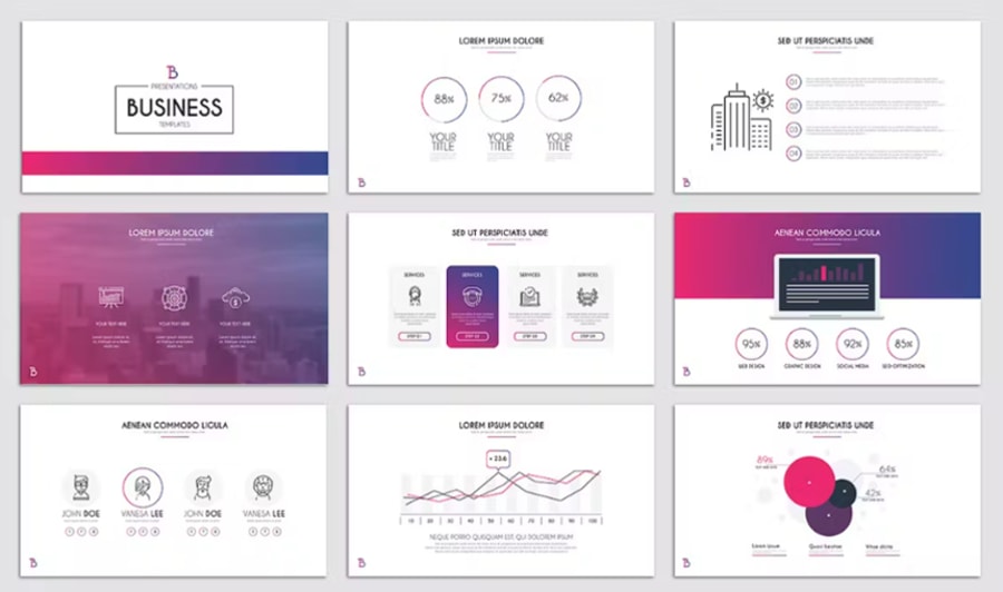
With tools like Tableau and Google Data Studio, you can turn complex data into interactive visuals that are easy to understand and explain your point further.
Data visualisation is crucial in visual presentations as it transforms complex data into easily understandable and visually appealing representations. Using charts, graphs, and infographics makes data more accessible, engaging, and memorable.
5. Motion graphics: the era of dynamic presentations
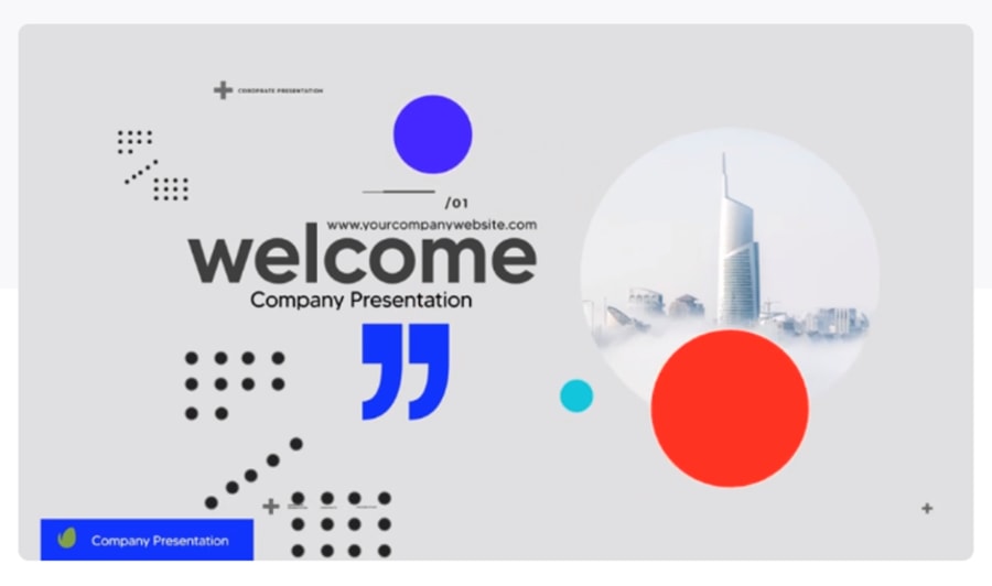
Incorporate short animations or video elements to break the monotony.
Motion graphics can add a dynamic and engaging element to a presentation design. Consider their purpose and relevance to the content to use motion graphics effectively. Use subtle animations to highlight key points and transitions to create a smooth flow. However, avoid overwhelming the audience with excessive motion; use this sparingly and only when it accentuates your point.
6. Dark mode: easy on the eyes
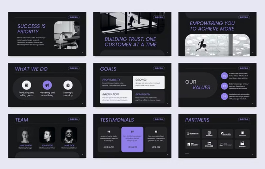
More platforms offer a dark mode, and presentations follow suit. Dark backgrounds make the text and other design elements pop.
To effectively use dark mode, choose a colour palette that contrasts well with the dark background, such as white or bright colours –like the example above. Be mindful of legibility and use high-contrast typography to ensure text is easy to read. Keep design elements simple and uncluttered to avoid overwhelming the audience.
7. Augmented reality (AR): the future is now
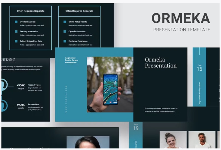
Though it isn't common, some presentations have started integrating Augmented Reality (AR) to offer immersive experiences. This could be a game-changer in high-stakes investor meetings.
Incorporating AR into your presentation adds sensory value, which can work great for showcasing a product or service in real-time. With a QR Code Generator, you can easily share your AR experience in the meetings.
AR can bring static graphics to life, provide 3D visualisations, send traffic to your website, and enable interactive demonstrations, creating a memorable and impactful experience for the audience. By leveraging AR technology, presentations can become more dynamic and captivating.
Best tools for creating presentations
Besides using tools to improve your business, various tools are available to create impressive presentations.
Here are some of the best tools to help you get the best results:
Microsoft PowerPoint
PowerPoint is a classic choice that offers robust features. With numerous templates and extensive customisation, PowerPoint remains a go-to for many.
Pricing: Available as part of Microsoft 365 subscription, which starts at £5.99/month for personal use and goes up to £18.10/user/month for businesses.
Apple Keynote
Known for its sleek design interface, Keynote is ideal for Mac users and those looking for high-quality templates.
Pricing: Free for Apple users, but requires an Apple device to access the software.
Google Slides
If you're looking for real-time collaboration, Google Slides is the answer. It may not be as feature-rich as others, but its cloud-based setup makes it versatile.
Pricing: Free, with optional Google Workspace subscriptions for businesses starting at £5/user/month.
Prezi
Prezi offers a canvas-like presentation space where you can zoom in and out of different points for those looking to break away from the linear model.
Pricing: Free plan (limited features) to £19/user/month for Prezi Business Premium.
Envato Elements
Envato Elements is for you if you need a subscription-based platform offering a vast library of digital assets. Choose from a wide range of graphics, templates, and fonts for creative projects.
Pricing: Monthly subscription starts at $16.50, offering access to a wide range of digital assets. That's about £13 when you convert it.
Visme
Ideal for data visualisation, Visme offers the ability to create infographics, reports, and more, along with your presentation.
Pricing: Free plan with basic features. Plans range from $29/month to $59/month. Visme is an American company, so prices are in USD - at the current conversion rate, that's about £23-£47.
Zoho Show
Zoho Show is a cloud-based tool that offers real-time collaboration and broadcasting features. It's a solid choice for remote presentations.
Pricing: Free plan for basic use. Zoho Show is also part of the broader Zoho One suite, which starts at £37/user/month.
Final tips for your next presentation
We've gathered a few key points that you can use as a checklist before your next presentation:
- Consistency is key: Stick to a design template and don't mix styles. A consistent design will ensure your presentation will go smoothly (visually, at least).
- Rehearse: The design should complement your speech, not replace it. Try practising a few days before your presentation to ensure you have everything. Remember your audience: Tailor your presentation according to the investors' interests and sector focus. If you're rehearsing and notice something off, you're on time to make last-minute changes.
- Test technical aspects: Always run a technical check (power, batteries, compatibility, equipment) to avoid last-minute glitches.
- Seek feedback: A test run in front of a smaller audience can provide invaluable insights. You can do this in front of coworkers and ask them for feedback about your presentation.
In conclusion, current trends lean toward simplicity, storytelling, and technology integration. A presentation, after all, is not just a collection of slides; it's a package of your ideas, your vision, and your promise. Choosing the right design elements can significantly enhance this package and increase your odds of winning over investors.
Whether you're a startup founder, a business leader, or a marketing expert aiming to raise capital, understanding these trends can equip you with the edge you need to succeed.
Wrapping up
There you have it! Presentation design trends that can make or break your investor meeting. Choose wisely, design compellingly, and you'll be well on your way to securing that crucial investment.
About the author
Alina Midori Hernández is a writer and designer at Envato Elements. She's passionate about design and the creative industry. Envato is an unlimited subscription service for digital assets, with a library that features a range of graphic design assets and templates and web templates.


These cookies are set by a range of social media services that we have added to the site to enable you to share our content with your friends and networks. They are capable of tracking your browser across other sites and building up a profile of your interests. This may impact the content and messages you see on other websites you visit.
If you do not allow these cookies you may not be able to use or see these sharing tools.