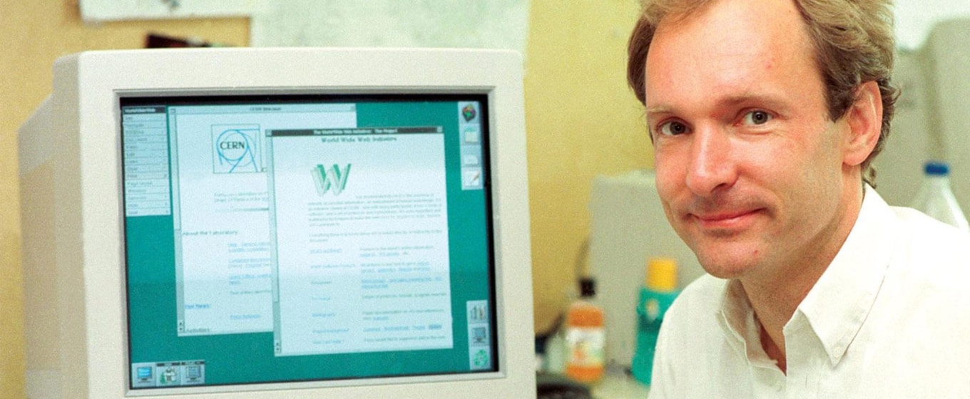
A little over 25 years ago, the world’s first website was made public. Tim Berners-Lee created a network of documents that linked together so that other CERN employees could collate company information in one place.
When the number of web browsers was limited to a few such as Mosaic or Line, optimizing the appearance of early websites was easy. Web developers had to design different websites for each browser, but with so few to choose from, this wasn’t much of a challenge.
A quarter of a century later, early web development methods have been rendered completely impractical. It is now unrealistic for smaller businesses to host and maintain different versions of a website. No longer do websites need to be individually designed for a limited number of specific browsers.
Focus has now shifted towards trying to optimize a single website for all possible combinations of browser, device and screen size. With a whole host of options across desktops, laptops, tablets, smartphones, games consoles, and many other devices, today’s developers have to employ safeguards and ubiquitous design methods to ensure content is delivered consistently across all possible platforms.
Google’s continually changing search algorithms have created another challenge for web developers. Keeping up with the algorithms requires frequent tweaking of websites. Last year, Google announced it would rank websites higher on mobile searches if they were mobile-friendly. As the impact on Google rankings was so significant, this situation has been referred to by many as ‘Mobilegeddon’.
Furthermore, Google announced this year that mobile-friendliness would be even more important when it came to mobile rankings.
To optimize one website for all browsers and devices, developers can use responsive web design (RWD). There are two main approaches to RWD, each with its own pros and cons.

Responsive design helps developers build websites that adapt to all devices
Growing old gracefully
Graceful degradation is an archaic approach to RWD. Web designers used to create a website offering users a better experience in one environment (a combination of browser and device) whilst gradually decreasing the experience for older ones. This was a great fix for websites that weren’t originally designed to be responsive, but given the website is optimized for only one environment, it can unavoidably lead to a negative experience for some users.
An unintended consequence of graceful degradation is an attitude that users without the latest browser or device should either put up with an inferior experience, or upgrade. Owners of older smartphone models might have experienced this before, when an app stopped updating because they were still on the old operating system. It’s frustrating and often alienates users as they find themselves begrudgingly having to forsake said app, or invest in a brand new device.
The best is yet to come
As more and more web traffic goes mobile, developers have taken the graceful degradation approach, but have chosen to optimize their website for mobile devices. Since 50% of web traffic now comes from mobiles, this seems like the most sensible option. However, like all websites designed with graceful degradation in mind, it is only a short-term solution.
More recently, developers have turned to progressive enhancement. This approach starts with offering a base user experience for those with the oldest devices or browsers. Every user gets equal access to all site content. Layers of CSS and JavaScript over HTML content mean that users with more modern platforms can benefit from additional features and functionality, therefore having a richer experience. However, this is not to the detriment of older platform users, who are still able to see all of the content.
The downside to this approach is that, as it is more challenging, it is therefore more expensive. More thought needs to go into the basic user experience that all visitors receive to make sure that they get equal access. Planning and implementation is more challenging, but maintenance is significantly easier, saving money in the long term.
While progressive enhancement is the current favourite when it comes to web design, it will inevitably soon fall out of fashion. The rise of mobile and the internet of things gives way for websites to not only provide information, but take it too. I imagine the next approach to web design will further exploit visitors’ data in order to build on current personalization trends, thus making it more suited to modern web usage patterns.
Either way, with the reach of the world wide web wider than ever, RWD has become best practice and a non-negotiable for developers around the world.
Photo of Tim Berners-Lee courtesy of Pietro & Silva (via Creative Commons)
About the author
Carl-Stéphan Parent manages the design, web and media teams at OVH, the web hosting and cloud computing company. He coordinates the management of projects across more than 15 subsidiaries and more than 100 websites worldwide.


These cookies are set by a range of social media services that we have added to the site to enable you to share our content with your friends and networks. They are capable of tracking your browser across other sites and building up a profile of your interests. This may impact the content and messages you see on other websites you visit.
If you do not allow these cookies you may not be able to use or see these sharing tools.